Andrej Tozon's blog

In the Attic

NAVIGATION - SEARCH

Countdown to Silverlight 3 #6: System colors

With Silverlight 3, we now have access to system colors. If you need your new application to visually fit into the operating system it’s running on, simply inspect one of the static properties, provided by the new SystemColors class – System.HighlightColor for example, will tell you what color is used for highlighting the selection in ListBoxes.

The provided example (below) will enumerate all available system colors and display them on the screen. To test it, go to your Control Panel and change the color scheme, then restart the application.

image image
Windows Aero vs. High Contrast Black

Additional reading
http://mtaulty.com/CommunityServer/blogs/mike_taultys_blog/archive/2009/04/29/
silverlight-3-system-colours.aspx

Run the sample online

Source code below:

Countdown to Silverlight 3 #5: ChildWindow (Modal, Non-modal, Templated)

There are many controls being introduced in Silverlight 3; a lot of them were pulled from the Silverlight Toolkit (the idea is that for every new Silverlight version, Toolkit controls marked as stable are moved to the Silverlight core. I’m not sure how many new controls I’m going to cover in this series, but the ChildWindow definitely deserves a separate post and sample.

ChildWindow is a special control, which behaves like a dialog. By default, it is set up to display itself as a modal dialog and can be easily re-templated to give it a new look (included in the sample below).

There are three steps required to make the ChildWindow display as a non-modal (floating) window:

1. Create a copy of the default template and get rid of all animations, referencing the Overlay element. The overlay covers all area “behind” the child window and makes it look disabled. If you remove the Overlay element itself, the window will not be centered on the screen when invoked, so it’s best to keep it in, but somehow hide it.

<Grid x:Name="Overlay" Width="0" Height="0" />

2. This is a hack. ChildWindow disables the root element when invoked so you have to re-enable it when window is shown:

Control root = Application.Current.RootVisual as Control;
if (root != null)
{
root.IsEnabled = true;
}

3. This is a hack. ChildWindow also takes control of re-focusing the window when the root control gains the focus so we have to hack into the ChildWindow’s LostFocus event to take care of this:

protected override void OnLostFocus(RoutedEventArgs e)
{
LostFocus -= Delegate.CreateDelegate(typeof(RoutedEventHandler), this,
    "ChildWindow_LostFocus") as RoutedEventHandler;
}

Additional reading:
http://timheuer.com/blog/archive/2009/05/10/silverlight-childwindow-non-modal-refactor.aspx (a better approach to non-modal window, also read the comments)

Run the sample below

Source code below:

Countdown to Silverlight 3 #4: Element binding

Binding to elements is yet another feature, known to WPF-ers since v1. Silverlight 3 now allows bindings between UI elements and their properties, without having to use other classes as a workaround. There are numerous cases of when to use such binding, mostly to automate user interface, starting from the basic example of connecting a TextBox to a Slider (also included in the sample below). The interesting point to this binding is that it also works two-way: the TextBox not only displays the current value of the Slider, entering a new value also updates the Slider.

To make the sample a bit more interesting, I included a new kind of panel, which stores the current mouse coordinates when moving it over the panel. I added two TextBoxes and bound them to the panel to display these coordinates. There’s also an ellipse, which… well, see for yourself ;)

Additional Reading
http://community.irritatedvowel.com/blogs/pete_browns_blog/archive/2009/06/24/
From-Silverlight-in-Action-2nd-Edition_3A00_-UI-Element-Binding.aspx

Run the sample online

Source code below:

Countdown to Silverlight 3 #3: Merged resource dictionaries

Coming from the WPF world, finding out that Silverlight lacked the feature of distributing application resources among separate files was one of those kick in a head moments. Well, not anymore. Silverlight 3, like its big brother WPF, now supports partitioning resources through merged dictionaries.

Merged resource dictionaries can be included as external files (build action = Content), as included resources (build action = Resource), or as referenced assembly resources (e.g. theming).

<Application.Resources>
<ResourceDictionary>
<ResourceDictionary.MergedDictionaries>
<ResourceDictionary Source="Themes/Theme1.xaml" />
<ResourceDictionary Source="Themes/Theme2.xaml" />
</ResourceDictionary.MergedDictionaries>
</ResourceDictionary>
</Application.Resources>

Merged resource dictionaries come in useful when:

  • providing different themes for the application (like in the sample below)
  • providing a new style/template for existing control
  • providing a style/template for a custom control

Run the sample online

Source code below:

Countdown to Silverlight 3 #2: Setting styles

Silverlight 3 is introducing a small, but very powerful feature: styles in Silverlight 3 can be set multiple times! For example, executing the following code in Silverlight 2 will throw a “catastrophic failure” exception on the second line:

textBox.Style = Application.Current.Resources["TextBoxStyle"] as Style;

Silverlight 3, on the other hand, won’t have any problems with setting control’s style the second, third or n-th time, if required.

To reset a control’s style, one can simply set it to null:

textBox.Style = null;

… or assign an empty style to it:

<Style x:Key="EmptyTextBoxStyle" TargetType="TextBox" />
 

Source code below:

Countdown to Silverlight 3 #1: Out of Browser applications

With Silverlight 3 knocking on the door (July 10?) it’s time to offload my Silverlight 3 examples. Not that they would show anything new (since SL3 Beta got out, new features had been demoed by various people to the death), it’s just another perspective or a way to go public with a sample code that’s been piling up on my desktop since the Beta was released. Anyway, this will be in a form of short posts with provided test page and sample code.

I’ll begin with probably the most talked about new feature – Out of Browser applications, which could also be referred to as installed applications.

First of – not every Silverlight application can be installed on the client machine. The developer must enable this by adding a <Deployment.Application> section to the application manifest (AppManifest.xml). This section provides more information about the application (name, title, description), along with optional icons in a few different sizes, which are used for branding your application and are displayed on various places on the desktop (install dialog, application shortcut, title bar, …)

Alternative way to installing the application (a common way is to install it through the Silverlight application right-click context menu) is to provide the user with a button of some sort, which would call the new Application.Current.Detach() method when clicked. Note that the method requires an explicit user action to succeed; calling it on the application load or perhaps inside a timer tick event should fail with the exception.

There’s the Application.Current.ExecutionState property telling the installation state of the application. Possible values include RunningOnline (not installed, the default), Detaching, Detached, DetachedUpdatesAvailable and DetachFailed (for describing various installed/ing states).

When installed, the application can be run as before, inside the browser, or, by calling it through a created shortcut (start menu, desktop), outside the browser. Inspecting the Application.Current.RunningOffline property will tell you how the application was run.

To check if application is connected to the network, there’s the NetworkInterface.GetIsNetworkAvailable() method, returning a simple true or false. Remember that being connected to the network doesn’t mean application has access to the internet, and certainly doesn’t imply that a network resource or a service application wants to call is accessible at all.

One last thing to mention is that Out of Browser application still run in a partial trust, the same security context as it would when run inside the browser. The isolated storage quota, however, increases to 25MB when application gets installed.

Additional reading
http://timheuer.com/blog/archive/2009/03/18/silverlight-3-offline-update-framework.aspx
http://msdn.microsoft.com/en-us/magazine/dd882515.aspx

Run the sample online

Source code below:

NTK09 – Slide decks from my talks

Had 2 talks at this year’s NT Konferenca.

The first one was about building LOB application with Silverlight, starting from what can we do today with v2 (ran a short, 2 min video of a Silverlight 2 LOB app we’re going to be releasing within few weeks) and what’s coming with v3. The last part was about .NET RIA Services.

The second talk was about Presentation Model (MVVM / Model-View-ViewModel) – from basics to actual working application – starting from a WPF version of an app, then porting the same ViewModel over to Silverlight to build a better UX and thorough testing, to finish with (again, with exactly the same ViewModel) a working version for Windows Forms (yes, that’s WinForms built with MVVM).

Fun.

Update: slides are in Slovenian language…

Dynamic Data Forms for Silverlight, revisited

A couple of weeks ago, I wrote a post about handling dynamic forms in Silverlight. With this continuation post, I’m going to make a few changes to the original project:

1. Implement a new, custom, field type and provide a template for it (I’ll write about it later), and
2. Make a few changes to the FormFieldTemplateSelector to make it more generic. So instead of writing templates like this:

A new TemplateSelectorDataTemplate…

<local:FormFieldTemplateSelector.StringTemplate>
    <DataTemplate>
        <TextBox Text="{Binding Value, Mode=TwoWay}" Width="100"/>
    </DataTemplate>
</local:FormFieldTemplateSelector.StringTemplate>
<local:FormFieldTemplateSelector.DateTimeTemplate>
    <DataTemplate>
        <basics:DatePicker SelectedDate="{Binding Value, Mode=TwoWay}" Width="100" />
    </DataTemplate>
</local:FormFieldTemplateSelector.DateTimeTemplate>

You could simply write:

<local:TemplateSelectorDataTemplate DataType="System.String">
    <TextBox Text="{Binding Value, Mode=TwoWay}" Width="100"/>
</local:TemplateSelectorDataTemplate>
<local:TemplateSelectorDataTemplate DataType="System.DateTime">
    <basics:DatePicker SelectedDate="{Binding Value, Mode=TwoWay}" Width="100" />
</local:TemplateSelectorDataTemplate>

You can see the DataType property on the TemplateSelectorDataTemplate used instead of using concrete templates like FormFieldTemplateSelecot.StringTemplate. This way, the FormFieldTemplateSelector’s DataType property can be matched with TemplateSelectorDataTemplate’s DataType property [long names confusion, I know] and you don’t have to factor a new template for each new field type you come with, making it feel a bit more like the DataTemplate implementation in WPF. Strings are used here instead of types. One reason for this is that Silverlight doesn’t support x:Type markup, and the second is the fact you can use any string to identify your field type: for example, you can use “#Signature#” string as a custom field type to insert a signature control into your form.

A written signature form field…

To demonstrate a support for custom field types, I created a special control, which will allow the user to sign herself on a special panel and the signature will be submitted to the server together with the other field values.

The control, which will allow us to write on it with the mouse, is of course InkPresenter. I’ve encapsulated it in another control, called SignaturePanel, which adds required mouse event handler which enables the user to write on the InkPresenter with a mouse. Here’s this control, contained within a new TemplateSelectorDataTemplate:

<local:TemplateSelectorDataTemplate DataType="#Signature#"> <local:SignaturePanel Width="100" Height="50"
Strokes="{Binding Value, Mode=TwoWay, Converter={StaticResource strokesConverter}}" /> </local:TemplateSelectorDataTemplate>

The template looks nothing special, except that strokesConverter, specified with the binding. What that does is serialize the Strokes collection from the InkPresenter when being written to the underlying ViewModel, where we need it when sending all submitted data over to the server side. This means that signature actually gets sent over the wire in a form of strokes collection, which you can store in a database. Alternatively, you could convert that strokes into the bitmap on the server and store the signature as an image [And I’ve yet to check how Silverlight 3 WritableBitmap can help doing this on the client]. Anyway, I’ve found StrokeCollection (de)serialization code in Julia Lerman’s Create Web Apps You Can Draw On with Silverlight 2 MSDN article and is included in the code sample attached to this post.

Here’s how the current form looks like:

image

Source code is now available. Please note that this is a Silverlight 3 project. It doesn’t contain any SL3 code, it’s just the project files were converted to SL3 when opened in Visual Studio.

All comments welcome. Enjoy.

Creating Silverlight Behaviors (with Blend 3 Interactivity dll)

Behaviors are not new in WPF / Silverlight world; it’s a common way of extending visual element’s behavior through the power of attached properties and everybody probably used one of these at least once in their projects. Now, there’s new Behaviors in town…

I first learned about the behaviors in this excellent, short but sweet MIX09 presentation by Pete Blois. In short: the new “breed” of behaviors will be supported in Blend 3, allowing designers to easily extend visual elements by drag’n’dropping a variety of behaviors onto them. If you’re not familiar with what behaviors are – imagine you have a Drag behavior... By setting it to any element in your window (in Blend / Xaml, no .NET code!), that element instantly gets draggable around that window. Yeah, that’s a powerful concept. And it doesn’t stop there. Watch the video, it’s worth the time…  And for detailed info, Christian is running a series on behaviors and other interactivity mechanism in his blog.

What I don’t get is why they are called Blend (3) behaviors, because they are not limited to Blend in any way. They would be as easily called Silverlight/WPF behaviors, or simply – Behaviors. Yes, that means you can use (and create) them even if you don’t have Blend 3 installed. Even Silverlight 3 is not required, it works with version 2 perfectly. You only need a special dll, which gets installed with Blend 3 – Microsoft.Expression.Interactivity.dll. I currently have no idea what the deployment story with this assembly is at the time of the writing (with Blend being in Beta and all), but you’ll find it in the c:\Program Files\Microsoft Expression\Blend 3 Preview\Libraries\[Silverlight] | [WPF]\ folder. This assembly (it comes in Silverlight and WPF flavor) provides the base interactivity classes and is required if you’re going to use behaviors in your application.

It should be quite obvious as to where behaviors fit in the designer / developer workflow: designers will be able to decorate visual elements with various behaviors and see them in action, while developer’s job will be to come up with new, not-yet-existing behaviors that designer had in mind when designing the UX.

There are a few examples of behaviors up and ready on Expression Gallery, but let’s take a look how we can develop our own behaviors using Visual Studio 2008.

The first behavior we’ll look into will be called the TransparencyBehavior. What it will do is make every element semi-transparent when the mouse is not directly over it. I’ll use one of my previous samples (a semaphore) as a building ground for this one. The lights on the semaphore will be semitransparent until mouse enters the light’s space for it to become fully visible. Let’s begin

First, you’ll need the Expression interactivity dll (see above). Once you find it, add it as a reference to your project. Then, create a class, deriving from Behavior<T>. The generic type T is the type of element you want to extend with this behavior. I’m using the Ellipse type for the purpose of this example to show a more concrete implementation. I could also use <FrameworkElement> because this type of behavior is so common it could be attached to element.

Update: updated the previous paragraph to make sense and align with the sample code.

public class TransparencyBehavior : Behavior<Ellipse> {}

We’ll need a couple of properties to control the behavior’s parameter: The InactiveTransparency property will hold an opacity value for element’s inactive state (when the mouse is not over) and the Duration will hold the time for the element to transition from active to inactive state (and vice versa).

To hook into the element we’re extending, we have to override the OnAttached method. It will be called when the element is being initialized so we have the chance to attach additional event handlers to element’s events. The extended element can be reached through the AssociatedObject property. In this method, I’m hooking up into MouseEnter and MouseLeave events to detect when mouse is over, initialize and construct a storyboard that will be triggered for state transition:

protected override void OnAttached()
{
    base.OnAttached();

    storyboard = new Storyboard();
    animation = new DoubleAnimation();
    animation.Duration = Duration;
    Storyboard.SetTarget(animation, AssociatedObject);
    Storyboard.SetTargetProperty(animation, new PropertyPath(Border.OpacityProperty));
    storyboard.Children.Add(animation);

    AssociatedObject.Opacity = InactiveTransparency;
    AssociatedObject.MouseEnter += OnMouseEnter;
    AssociatedObject.MouseLeave += OnMouseLeave;
}
Similarly, there's the OnDetaching method that we can use to clean up (remove event handlers etc.) The rest of the class are just the handlers:
 
void OnMouseLeave(object sender, MouseEventArgs e)
{
    animation.To = InactiveTransparency;
    storyboard.Begin();
}

void OnMouseEnter(object sender, MouseEventArgs e)
{
    animation.To = 1;
    storyboard.Begin();
}
 
To finish, here’s a piece of modified (from the previous semaphore example) piece of Xaml using the behavior:
 
<Ellipse Fill="{Binding Brush}" Width="50" Height="50" Stroke="Black">
    <i:Interaction.Behaviors>
        <local:TransparencyBehavior Duration="00:00:00.2" InactiveTransparency="0.5" />
    </i:Interaction.Behaviors>
</Ellipse>
That’s all for this simple behavior. In future posts, I’ll come up with new behaviors and put them in the context of some other samples I’ve used in the previous posts.
[Hint: in the below sample, hover over green lights]

The way to create new behaviors is very similar to using “direct” approach with attached properties. The Behavior base class provides a very convenient infrastructure to build on, and porting the “old way” attached behaviors to this new model shouldn’t be that difficult. Behaviors are not limited to use in Blend 3 and work with Silverlight 2 too. With that, it would be great to see Microsoft releasing the interactivity dll as a standalone release or a part of some other SDK, not tying it to either Blend 3 or any particular Silverlight version.

The source code for this sample is available. Please note that the project is a Silverlight 3 project and doesn’t include the Expression Interactivity dll.

Update: the above code was updated to match Silverlight 3 / Blend 3 RTM bits. Thanks To Michael Washington for taking the time to update the behavior.

Shout it

Dynamic Data Forms for Silverlight with a Data Template Selector Control

The basic idea behind this post is to show a simple way for items/list controls to display each item data with a different template. The ideal candidate for such exercise are data forms, where user can enter different kinds of information - text, numbers, check marks, etc. Imagine a scenario, where each data form field would be presented as a separate ListBox item… no matter of what data type that field is.

The data model for this solution is going to be very simple and generic. We’ll need a generic class, which will represent a single field in a form. Each field will have an id, a caption, a value (entered by the user) and a value type (what’s the type of the value – text, integer, date, etc.):

public class AutoFormField
{
    public Guid Id { get; private set; }
    public string Caption { get; set; }
    public string Value { get; set; }
    public string Type { get; set; }

    public AutoFormField()
    {
        Id = Guid.NewGuid();
    }
}

When the user requests a form, the associated web service will return a collection of AutoFormFields, representing all fields in the form that user should fill out. I’m not using any database for this example, so I’ve hardcoded the fields, returning to the client, in the service itself:

public class AutoFormService : IAutoFormService
{
    public Collection<AutoFormField> GetForm()
    {
        Collection<AutoFormField> form = new Collection<AutoFormField>();
        form.Add(new AutoFormField()
        {
            Caption = "Name: ",
            Type = typeof(string).FullName
        });
        form.Add(new AutoFormField()
        {
            Caption = "Last name: ",
            Type = typeof(string).FullName
        });
        form.Add(new AutoFormField()
        {
            Caption = "Birth date: ",
            Type = typeof(DateTime).FullName
        });
        form.Add(new AutoFormField()
        {
            Caption = "Is employed: ",
            Type = typeof(bool).FullName,
            Value = false.ToString()
        });
        return form;
    }
}
 
The above code shows that the form consists of two text fields, a date and a yes/no field. We would naturally want to display TextBoxes for text entry, DatePicker for a date, and a CheckBox for a yes/no field entry. The Type property contains an identifier, which will tell the client what kind of entry field to display; field data type names are used here for convenience.
Let’s move to the client and implement this.
 
I’ll use the ItemsControl to display the items, because I don’t need the notion of a selected item (yet). Let’s first get the basics out of the way; this is how the ItemsControl looks like, displaying all the form’s captions:
 
<ItemsControl ItemsSource="{Binding Fields, Source={StaticResource viewModel}}">
    <ItemsControl.ItemTemplate>
        <DataTemplate>
            <TextBlock Text="{Binding Caption}" />
        </DataTemplate>
    </ItemsControl.ItemTemplate>
</ItemsControl>
Its ItemsSource property is bound to a ViewModel’s Fields property, which gets populated when a call to the GetForm() web service method returns. The ItemTemplate is set up so that TextBlock displays the fields’ captions.

What we need to do next is display the actual entry fields the user will fill in. I already mentioned the Type property; this will be the key in deciding what kind of control to display.

If we would be coding this in WPF, we would use a DataTemplateSelector to help us out with selecting the right template to load for a specific type. Unfortunately, this feature is not implemented in Silverlight, so we’re on our own here. As it turns out, there isn’t much code required to come up with a solution. This is something that I call…

… a data template selector control…

For our example, we need templates for: a TextBox, a DatePicker and a CheckBox. The following user control will accept all these templates as properties and contain logic to choose between them based on a certain property, which will be bound to AutoFormField’s Type property:

public class FormFieldTemplateSelector : UserControl { public DataTemplate StringTemplate { get; set; } public DataTemplate DateTimeTemplate { get; set; } public DataTemplate BooleanTemplate { get; set; } public DataTemplate SignatureTemplate { get; set; } public static readonly DependencyProperty FieldTypeProperty = DependencyProperty.Register("FieldType", typeof(string), typeof(FormFieldTemplateSelector), new PropertyMetadata(string.Empty));


public string FieldType { get { return (string)GetValue(FieldTypeProperty); } set { SetValue(FieldTypeProperty, value); } } public FormFieldTemplateSelector() { Loaded += new RoutedEventHandler(OnLoaded); } private void OnLoaded(object sender, RoutedEventArgs e) { string fieldType = FieldType; if (fieldType == typeof(string).FullName) { Content = StringTemplate.LoadContent() as UIElement; } else if (fieldType == typeof(DateTime).FullName) { Content = DateTimeTemplate.LoadContent() as UIElement; } else if (fieldType == typeof(bool).FullName) { Content = BooleanTemplate.LoadContent() as UIElement; } else { Content = null; } } }

The way to set it up in the item template is simple too. Here’s the complete ItemTemplate:

<Grid>
    <Grid.ColumnDefinitions>
        <ColumnDefinition MinWidth="100" />
        <ColumnDefinition Width="*" />
    </Grid.ColumnDefinitions>
    <TextBlock Text="{Binding Caption}" VerticalAlignment="Center" />
    <local:FormFieldTemplateSelector Grid.Column="1" FieldType="{Binding Type}" Margin="0,2,0,2">
        <local:FormFieldTemplateSelector.StringTemplate>
            <DataTemplate>
                <TextBox Text="{Binding Value, Mode=TwoWay}" Width="100"/>
            </DataTemplate>
        </local:FormFieldTemplateSelector.StringTemplate>
        <local:FormFieldTemplateSelector.DateTimeTemplate>
            <DataTemplate>
                <basics:DatePicker SelectedDate="{Binding Value, Mode=TwoWay}" Width="100" />
            </DataTemplate>
        </local:FormFieldTemplateSelector.DateTimeTemplate>
        <local:FormFieldTemplateSelector.BooleanTemplate>
            <DataTemplate>
                <CheckBox IsChecked="{Binding Value, Mode=TwoWay}" />
            </DataTemplate>
        </local:FormFieldTemplateSelector.BooleanTemplate>
    </local:FormFieldTemplateSelector>
</Grid>

Of course, this is just one way to put it together. You're free to style each field completely to your liking. This is what we have so far:

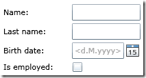
To wrap this up, you just have to add a button to submit the form back to the server. I’m not discussing this here since it’s pretty straightforward.

I will, however, continue to build up on this example in the next couple of posts. Some topics I’ll dig into is styling, positioning and more (interesting) templates. I’ll also post the full code in the final post of this series.