One of probably most underused features in windows desktop UI development world is got to be the use of a Label as an accessor to its pair control. I rarely see developers using this possibility to enhance keyboard UI navigation.
A couple of things changed about this mechanism when going from Windows Forms to WPF:
- The escape character to mark the mnemonic (the letter/key for accessing related control) changed from ‘&’ to ‘_’;
- In Windows Forms, the control that received focus was always the one that was next in tab order. With WPF, the pair control is specified with the Label.Target dependency property.
A simple form with this feature enabled would look like:
1: <Grid>
2: ...
3: <Label Target="{Binding ElementName=firstNameBox}" Content="_First name:"/>
4: <TextBox Name="firstNameBox" Grid.Column="1"/>
5: <Label Target="{Binding ElementName=lastNameBox}" Content="_Last name:" Grid.Row="1" />
6: <TextBox Name="lastNameBox" Grid.Column="1" Grid.Row="1"/>
7: ...
8: </Grid>
The best thing about Label's Target property is not only it sets focus to its pair control, but can also pose as a bridge back to the Label when we need to provide some feedback from the target control. For example, when a TextBox gets disabled, we would want the associated Label render disabled as well. This is fairly easy to achieve through binding. All we need is a simple style for a label:
1: <Style TargetType="{x:Type Label}">
2: <Setter Property="IsEnabled" Value="{Binding Path=Target.IsEnabled, RelativeSource={RelativeSource Self}}" />
3: </Style>
The key is in binding's path, which queries target's IsEnabled property and sets it accordingly.
This opens up a range of possibilities. One of my favorite UI tricks is to visually differentiate the focused control from the others by slightly contrasting the label, associated with the focused control. Label.Target is perfect for this.
I built on my previous example and the result now looks like this:
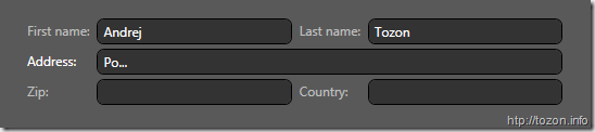
And here's the Label style I used:
1: <Style TargetType="Label">
2: <Setter Property="Foreground" Value="{StaticResource LabelTextBrush}" />
3: <Style.Triggers>
4: <DataTrigger Binding="{Binding Path=Target.IsFocused, RelativeSource={RelativeSource Self}}" Value="True" >
5: <Setter Property="Control.Foreground" Value="{StaticResource FocusedLabelTextBrush}" />
6: </DataTrigger>
7: </Style.Triggers>
8: </Style>
It's similar to the previous one, it just uses a DataTrigger to set Label's foreground color instead of direct property mapping.
I also added a short animation to make TextBoxes flash for a moment when they receive focus.
You can see all this in action by downloading and executing this Loose Xaml page.
5fab9736-16f4-4772-9791-82e2f4952c71|0|.0|27604f05-86ad-47ef-9e05-950bb762570c