The basic idea behind this post is to show a simple way for items/list controls to display each item data with a different template. The ideal candidate for such exercise are data forms, where user can enter different kinds of information - text, numbers, check marks, etc. Imagine a scenario, where each data form field would be presented as a separate ListBox item… no matter of what data type that field is.
The data model for this solution is going to be very simple and generic. We’ll need a generic class, which will represent a single field in a form. Each field will have an id, a caption, a value (entered by the user) and a value type (what’s the type of the value – text, integer, date, etc.):
public class AutoFormField
{
    public Guid Id { get; private set; }
    public string Caption { get; set; }
    public string Value { get; set; }
    public string Type { get; set; }

    public AutoFormField()
    {
        Id = Guid.NewGuid();
    }
}
When the user requests a form, the associated web service will return a collection of AutoFormFields, representing all fields in the form that user should fill out. I’m not using any database for this example, so I’ve hardcoded the fields, returning to the client, in the service itself:
public class AutoFormService : IAutoFormService
{
    public Collection<AutoFormField> GetForm()
    {
        Collection<AutoFormField> form = new Collection<AutoFormField>();
        form.Add(new AutoFormField()
        {
            Caption = "Name: ",
            Type = typeof(string).FullName
        });
        form.Add(new AutoFormField()
        {
            Caption = "Last name: ",
            Type = typeof(string).FullName
        });
        form.Add(new AutoFormField()
        {
            Caption = "Birth date: ",
            Type = typeof(DateTime).FullName
        });
        form.Add(new AutoFormField()
        {
            Caption = "Is employed: ",
            Type = typeof(bool).FullName,
            Value = false.ToString()
        });
        return form;
    }
}
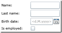
The above code shows that the form consists of two text fields, a date and a yes/no field. We would naturally want to display TextBoxes for text entry, DatePicker for a date, and a CheckBox for a yes/no field entry. The Type property contains an identifier, which will tell the client what kind of entry field to display; field data type names are used here for convenience.
Let’s move to the client and implement this.
I’ll use the ItemsControl to display the items, because I don’t need the notion of a selected item (yet). Let’s first get the basics out of the way; this is how the ItemsControl looks like, displaying all the form’s captions:
<ItemsControl ItemsSource="{Binding Fields, Source={StaticResource viewModel}}">
    <ItemsControl.ItemTemplate>
        <DataTemplate>
            <TextBlock Text="{Binding Caption}" />
        </DataTemplate>
    </ItemsControl.ItemTemplate>
</ItemsControl>
Its ItemsSource property is bound to a ViewModel’s Fields property, which gets populated when a call to the GetForm() web service method returns. The ItemTemplate is set up so that TextBlock displays the fields’ captions.
What we need to do next is display the actual entry fields the user will fill in. I already mentioned the Type property; this will be the key in deciding what kind of control to display.
If we would be coding this in WPF, we would use a DataTemplateSelector to help us out with selecting the right template to load for a specific type. Unfortunately, this feature is not implemented in Silverlight, so we’re on our own here. As it turns out, there isn’t much code required to come up with a solution. This is something that I call…
… a data template selector control…
For our example, we need templates for: a TextBox, a DatePicker and a CheckBox. The following user control will accept all these templates as properties and contain logic to choose between them based on a certain property, which will be bound to AutoFormField’s Type property:
public class FormFieldTemplateSelector : UserControl
{
    public DataTemplate StringTemplate { get; set; }
    public DataTemplate DateTimeTemplate { get; set; }
    public DataTemplate BooleanTemplate { get; set; }
    public DataTemplate SignatureTemplate { get; set; }

    public static readonly DependencyProperty FieldTypeProperty =
        DependencyProperty.Register("FieldType", typeof(string),
        typeof(FormFieldTemplateSelector), new PropertyMetadata(string.Empty));

     public string FieldType
    {
        get { return (string)GetValue(FieldTypeProperty); }
        set { SetValue(FieldTypeProperty, value); }
    }

    public FormFieldTemplateSelector()
    {
        Loaded += new RoutedEventHandler(OnLoaded);
    }

    private void OnLoaded(object sender, RoutedEventArgs e)
    {
        string fieldType = FieldType;
        if (fieldType == typeof(string).FullName)
        {
            Content = StringTemplate.LoadContent() as UIElement;
        }
        else if (fieldType == typeof(DateTime).FullName)
        {
            Content = DateTimeTemplate.LoadContent() as UIElement;
        }
        else if (fieldType == typeof(bool).FullName)
        {
            Content = BooleanTemplate.LoadContent() as UIElement;
        }
        else
        {
            Content = null;
        }
    }
}
The way to set it up in the item template is simple too. Here’s the complete ItemTemplate:
<Grid>
    <Grid.ColumnDefinitions>
        <ColumnDefinition MinWidth="100" />
        <ColumnDefinition Width="*" />
    </Grid.ColumnDefinitions>
    <TextBlock Text="{Binding Caption}" VerticalAlignment="Center" />
    <local:FormFieldTemplateSelector Grid.Column="1" FieldType="{Binding Type}" Margin="0,2,0,2">
        <local:FormFieldTemplateSelector.StringTemplate>
            <DataTemplate>
                <TextBox Text="{Binding Value, Mode=TwoWay}" Width="100"/>
            </DataTemplate>
        </local:FormFieldTemplateSelector.StringTemplate>
        <local:FormFieldTemplateSelector.DateTimeTemplate>
            <DataTemplate>
                <basics:DatePicker SelectedDate="{Binding Value, Mode=TwoWay}" Width="100" />
            </DataTemplate>
        </local:FormFieldTemplateSelector.DateTimeTemplate>
        <local:FormFieldTemplateSelector.BooleanTemplate>
            <DataTemplate>
                <CheckBox IsChecked="{Binding Value, Mode=TwoWay}" />
            </DataTemplate>
        </local:FormFieldTemplateSelector.BooleanTemplate>
    </local:FormFieldTemplateSelector>
</Grid>
Of course, this is just one way to put it together. You're free to style each field completely to your liking. This is what we have so far: 
To wrap this up, you just have to add a button to submit the form back to the server. I’m not discussing this here since it’s pretty straightforward.
I will, however, continue to build up on this example in the next couple of posts. Some topics I’ll dig into is styling, positioning and more (interesting) templates. I’ll also post the full code in the final post of this series.
ae296428-7fd4-4727-85bd-2565801d80ef|9|4.7|27604f05-86ad-47ef-9e05-950bb762570c